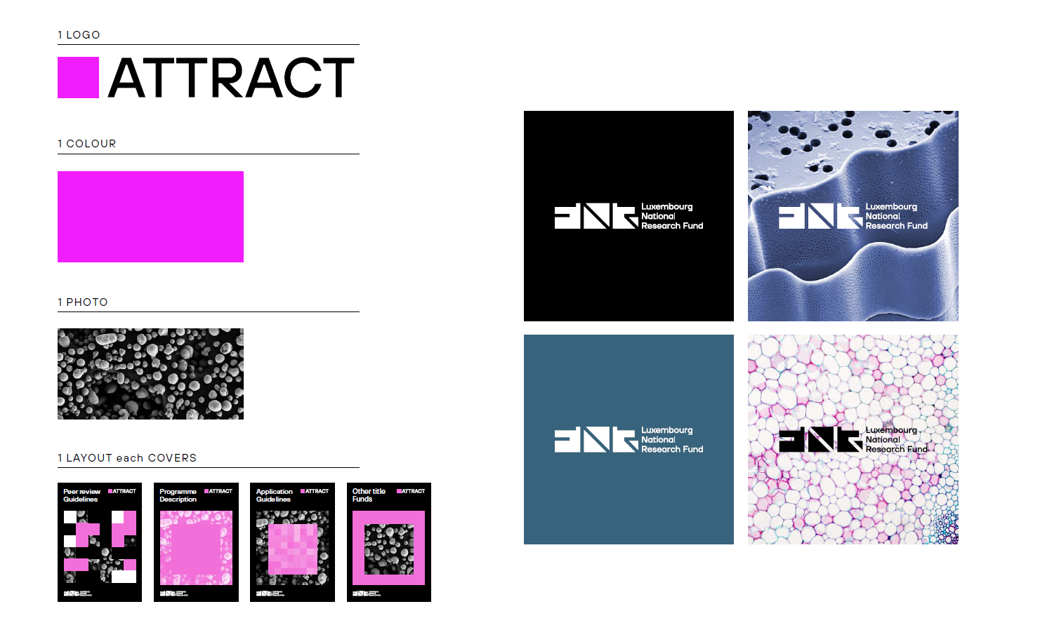
Download logo & guidelines
FNR’s Brand Evolution: A Fresh Look that Connects, Inspires, and Makes an Impact
We are thrilled to announce the revamping of the FNR brand, symbolising our unwavering commitment to innovation and excellence in research. For over two decades, the FNR has been a vital force in supporting Luxembourg’s research community, fuelling high-quality research projects across the globe and helping drive promotion of science in the country. Our new visual identity – created together with Luxembourg agency Studio Polenta – represents our commitment to advancing research and innovation in Luxembourg while reflecting our values of excellence, collaboration, and impact.


An evolved FNR brand identity made in Luxembourg
Our brand revamp encompasses a new logo, visual identity, and colours that resonate profoundly with the research community and the wider public. We have adopted a universal approach, referring to the organisation as the Luxembourg National Research Fund (FNR) in all languages, emphasising our inclusive and collaborative nature.
The new visual identity is a powerful reflection of FNR’s values. It has been designed to be modern, dynamic, and forward-looking, capturing the essence of our role as a leading research funding agency in Europe. Through our new logo, colour scheme, and typography, we aim to create a visual identity that represents who we are today and embodies our aspirations for the future.
We chose Luxembourg agency StudioPolenta to create our new visual identity, having previously also worked with StudioPolenta on the visual aspects of letzSCIENCE and the FNR Science Image Competition.
Made with Luxembourg science & research at the heart
The FNR’s new visual identity has images of science and research from Luxembourg at the heart: The hundreds of stunning images submitted to the FNR Science Image Competitions are now a key part of the FNR visual identity, found across the new FNR website and the new FNR document layouts.

Why the refresh?
Over time, brands need to adapt and evolve to create a consistent and cohesive experience across all touchpoints. We want to ensure that FNR remains at the forefront of research. To do so, we need a brand that truly resonates with our diverse audiences. Our refreshed visual identity will enhance recognition among researchers, policymakers, and the general public, making FNR more visible and memorable.
This new visual identity seamlessly fits our numerous initiatives, such as Mr Science, FNR Awards, FNR Science Image Competition, Researchers at School (Chercheurs à l’école), Researchers’ Days, Spotlight on Young Researchers or letzSCIENCE. These initiatives are significant in supporting the promotion of research and innovation in Luxembourg, and our refreshed brand identity provides a powerful tool to promote them effectively. With stronger brand recognition, versatility, inclusivity, innovation, and impact, FNR’s new visual identity catalyses positive change.
New fnr.lu
The brand refresh also includes a new and improved FNR website: Following a long feedback process with FNR stakeholders, the new FNR website not only features the new FNR visual identity but also a number of improvements and new features requested by our stakeholders, including:
- A better overview of the growing number of FNR funding instruments
- News can now be filtered by additional topics and publication year
- New document management: FNR Call documents are now hosted on SharePoint (no longer OwnCloud), making it possible for visitors to see when a document was last updated.
- A range of new and improved pages on various aspects of funding process and research culture.
- Dedicated pages for FNR events
We worked with Lola Strategy & Design on the web development of the new website.
